Sunday, May 19, 2013

Cyanotype workshop

The Cyanotype workshop was particularly fun for me because it didnt have any pressure on it... i could just play around and be happy with the results, which i definitely was! Its a printing process that gives a bright cyan blue print. I love the strong colours of the blues and the different tones you can achieve by layering different materials onto the coated paper. The process was popular in the 20th Century, and is how the term 'blue prints' came about. Learning about all the chemicals and how the process works was really interesting, and i loved not knowing how the images were going to turn out. 


 I printed a negative version of some images i have already taken onto acetate paper and used it as a negative to create a positive cyanotype print, the longer the print is exposed to sunlight the darker the shades of blue of the cyanotype print.


I also wrote words onto acetate paper and used them to add an extra detail to the cyanotype print. Words that contradicted the actual image I think were the most effective, for example, 'delicate' against a picture of the Eiffel Tower.


I would love to work with this process again but i'm not sure when it would be most appropriate and how well it would work as a final outcome.

Wednesday, May 8, 2013

Working with 5x4 for Visual Poetry

So after receiving many comments during my crit saying that the images should be more detailed and that the concept behind the project shouldn't be quite so obvious I decided to re-shoot, using the HARDEST CAMERA in the world! 5x4!

The film had to be loaded into slides in pitch black darkness of the darkroom (which was quite tricky) but then the whole set up of the camera was so much worse. I had to ensure the camera was focused and set correctly before loading each individual negative slide and then exposing it for around 2 and a half seconds (due to the 125 iso).

The next horrible step was developing them, where once again in pitch black darkness, i had to load the negatives individually onto a holder which had grooves on to help but it was fiddly and annoying. Anyways, they developed alright.

I took 5 negatives:

-1 didn't even expose.

-2 have light flares from where light has somehow managed to leak into the slide/camera before exposure and look like so:


and 2 are quite promising although the one of the model and the dolls house isn't quite in focus (which is really annoying).


Wednesday, February 6, 2013

Project 12: Still Life

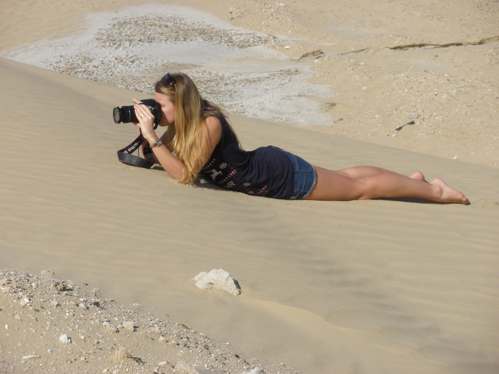
So for this brief i would be over in Dubai for christmas, i started thinking about how fragile the state of our planet is and i really like the idea of almost trapping the nature inside a bubble of conservation. I like the idea of somehow including hints of encroaching man made structures in the background and the foreground. The shoot went quite well and i ended up driving into the surrounding deserts of Dubai with my little bubble and shooting the image at ground level. 


My dad being a silly bugger whilst helping me with my shoot!


The final images were square cropped and actually removed the outer casing of the bubble to almost trick the viewer and confuse them as to why the background has that wavy effect. I was happy with these images but i wish that the imperfections on the glass (dust and sand) could have been avoided. 


New Blog Poster!


Tuesday, February 5, 2013

Old Dubai vs. New Dubai

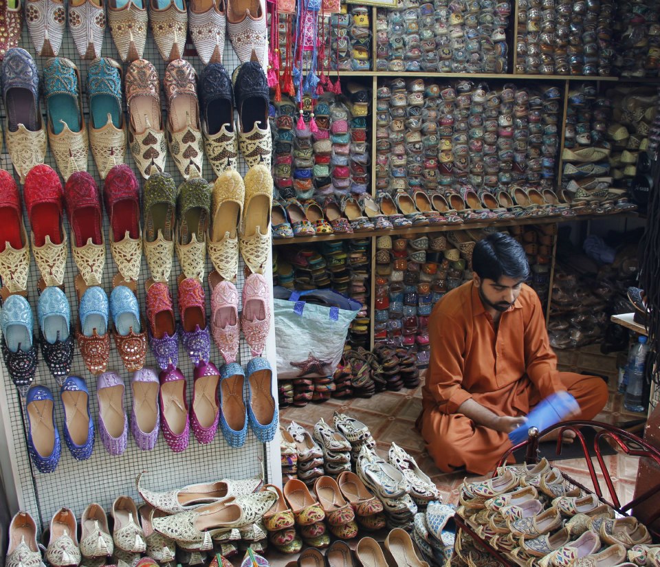
My friend Gemma Graham and I decided to go to the old soukh in Dubai over the christmas holidays, which as you can see from previous posts, i LOVE about Dubai. We decided early morning would be the best time to go because it gets quite busy but when we were driving along the sheikh zayeed road the morning fog looked so beautiful against the tall buildings that we had to stop to take some pictures. I really like how the new shiny buildings look like they're growing out of the old heritage below. The black and white images i think are particularly effective because they look more intimidating and sinister.